Using Your Manufacturing and Financial Data to Increase Profits: Visualizing Gross Profit
You collect lots of data: shop floor labor, machine utilization, inventory movements, quality, cost drivers…the list goes on. How do you turn that data into information that you can use to increase your profitability? At Chortek, this is exactly what we do with our Outsourced Accounting & Advisory Services.
In this article, I’ll provide an overview of how you can use modern data analytic tools to understand your data and make decisions that can lead to higher profits. Chortek is a big fan of a tool called Microsoft Power BI. It allows you to connect to your manufacturing and financial system(s), automatically pulling information in the background for near real-time analysis and decision-making.
Through our work with many different manufacturing clients, we’ve developed manufacturing-centric views of information to help business owners, Operations, Estimating/Quoting and Sales make timely decisions. I’ll share one specific example.
Visualizing gross profit
Is every dollar the same?
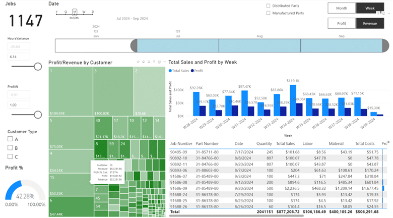
The following screenshots illustrate different ways of graphically depicting gross profit. Using any time range, we can use Power BI to calculate the gross profit on individual jobs/orders/parts/projects and then summarize it by customer, product mix, or other ‘things’.
The first screenshot depicts data from three months of jobs/orders/parts/projects. If you are not used to viewing your information in this format, it can seem like a lot. The remaining screenshots will further break down how we use this view to analyze manufacturing data.

The large green rectangle is broken into many smaller rectangles. Each rectangle illustrates the data in two ways which help tell an interesting story. One, the larger the rectangle, the higher the revenue. Two, the color coding is the key to understanding profitability: the darker the green, the higher the gross profit.
Notice rectangles #6 and #15 in the bottom left corner. They are almost the same size, so visually, we can tell that the revenue over the three months is approximately the same for both customers (the revenue for customer #6 is $47K, and for customer #15 is $52K). However, notice how much darker the green is for customer #6 compared to customer #15. The gross profit dollars and the gross profit percentage are dramatically different: the gross profit for customer #6 is $29K at 62%, whereas the gross profit for customer #15 is only $19K at 37%.

But, what do you do with that information?
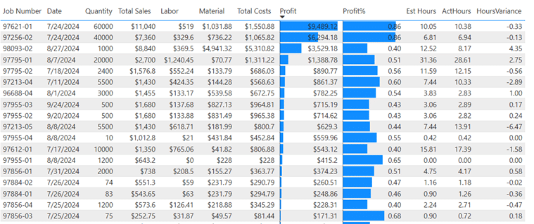
Clicking one of the green rectangles filters the grid to the right with the specific jobs/parts run during the time period, allowing further drill-down and investigation.

The final screenshot depicts the same data within the green rectangles as a scatter plot. What patterns do you see in the graph? What story does it tell? What questions do you have?
How to use the visualization of gross profit to increase profitability
Your team can use visualizations of gross profit in several ways. Outliers can be investigated and reviewed: monthly, weekly, even daily. The quoting/estimating team can review the visuals regularly to ensure that new parts or re-quotes are hitting targeted gross margin levels. Operations can review budget vs. actual costing details to understand root causes and either make changes on how future jobs are run or collaborate with the quoting/estimating team on pricing.
Conclusion
The data you collect in your business every day is valuable. The human eye is very good at finding patterns and picking out outliers from pictures. Microsoft Power BI helps ‘paint the pictures’ from your data, automatically refreshing in the background so that you are not relying on manual processes or running reports that might need to be summarized, thrown into Pivot Tables, etc. Microsoft provides excellent, free online training for Power BI. Please reach out to Chortek if you are interested in leveraging Power BI in your business.


